


DESIGNING THE MOBILE QUIZ

CONTEXT
THE PROBLEM
Better Off’s Personality Quiz is a key part of the user onboarding journey, shaping both initial impressions and downstream personalization. However, the original version, presented as a basic typeform with multiple-choice checkboxes, felt more like a survey than an engaging interaction. This created a flat first impression, limiting engagement and reducing user excitement. To improve retention, we set out to design the mobile quiz into an immersive, playful experience that captivates users from the very beginning.
PROJECT GOALS
🌱 Improve onboarding by making the personality quiz feel like a seamless and engaging entry point into the app experience.
✨ Elevate first impressions through tone and visuals that reinforce brand identity.
🎨 Expand the design system for scalability.
🎮 Introduce playfulness without compromising clarity.
✅ Increase quiz completions by designing a quiz experience that feels rewarding and encourages users to continue exploring the app.
COMPETITIVE RESEARCH
We began by analyzing onboarding flows and profile-creation patterns across adjacent mobile products. Since Better Off had no direct competitors, we focused on identifying recurring UX conventions, friction points, and opportunities to differentiate. This research helped us understand how familiar interaction patterns and strong first impressions can drive engagement and long-term retention.
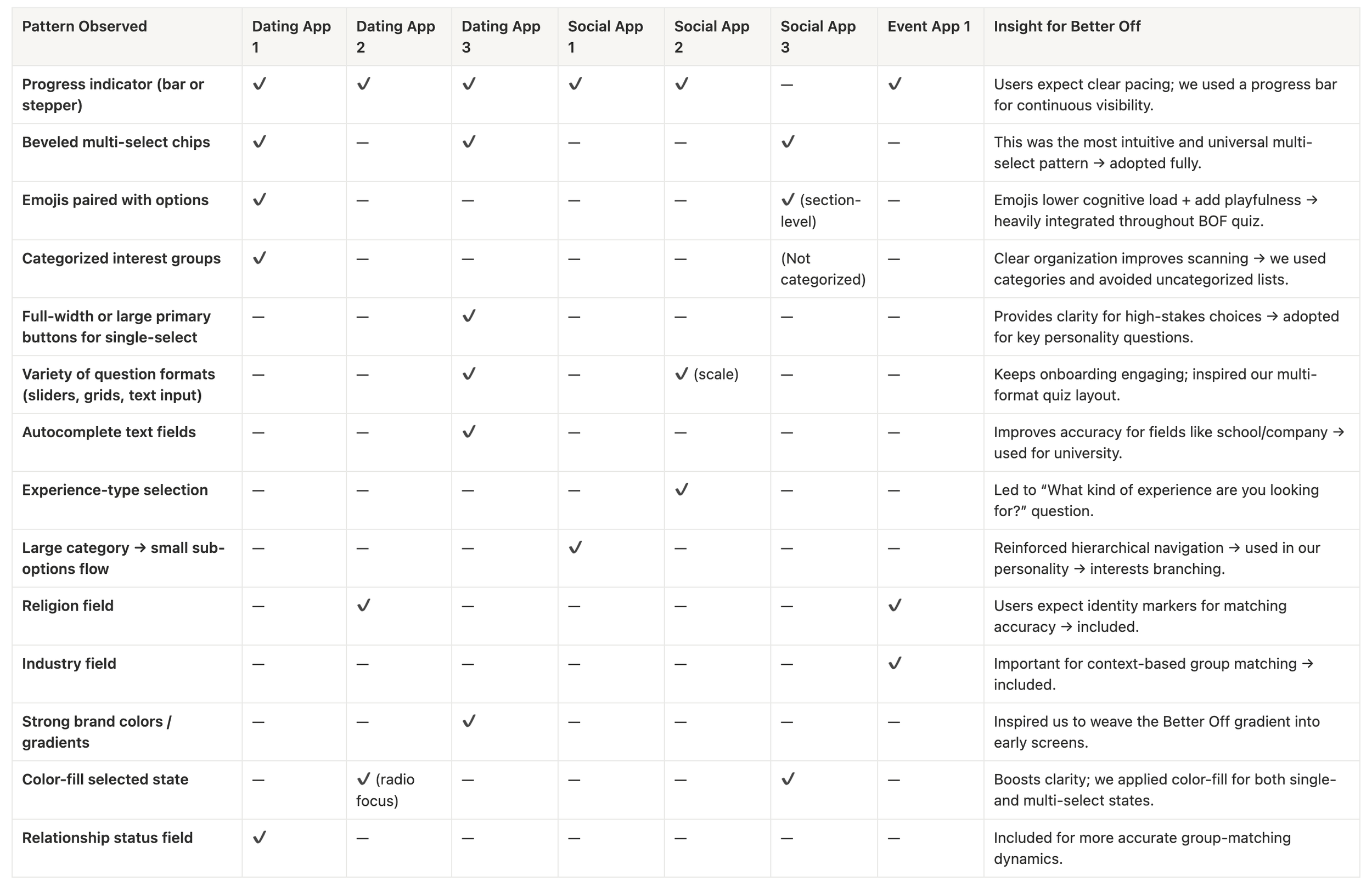
With these patterns identified, the research showed that users respond best to onboarding flows that feel both familiar and visually expressive. Recognizing the impact of progress indicators, beveled chips, emoji-driven micro-UI, and strong visual hierarchy gave us a foundation of proven interaction models to build from.
These insights directly informed our next phase: iterating on the quiz experience to blend intuitive interaction patterns with Better Off’s playful brand identity, ultimately shaping a flow designed for clarity, engagement, and more accurate matching.
THE DESIGN PROCESS
THE QUESTION FRAME
🧭 Improve onboarding | ✨ Elevate first impressions | 🎨 Expand the design system
Our first task was to redesign the basic multiple-choice form and establish a foundational quiz layout to inform the structure of all subsequent question UI frames. The layout needed to be adaptive— capable of handling varying character lengths and responsive across different screen sizes to account for potential line wrapping on smaller devices.
I explored several design variations, including options with no selection marker, radio buttons, and multiple-choice letter indicators. During beta testing, we found that users associated the lettered format with single-answer quizzes, which reinforced the expectation to choose only one option, aligning well with the question type.

SPECTRUM QUESTIONS
🌱 Improve onboarding | 🎮 Introduce playfulness | 🎨 Expand the design system | ✅ Increase quiz completions
By this stage, we had finalized the quiz navigation to include a “Back” option, allowing users to revisit the previous question, as well as an “Exit” feature to save their progress and return later.
The next challenge we tackled was designing for spectrum-style questions, where responses represent varying degrees of intensity or preference. While it initially felt intuitive to follow the same multiple-choice format, we wanted to create a more gamified and interactive experience. I began exploring alternative layouts where the input method visually mirrored the structure of the question, reinforcing the idea of a continuum rather than discrete options.
By introducing variety across input types, we aimed to increase quiz completions by making each question feel like a fresh, interactive moment users could look forward to.

MULTI-SELECTING INTERESTS
🌱 Improve onboarding | 🎮 Introduce playfulness | ✨ Elevate first impressions | 🎨 Expand the design system | ✅ Increase quiz completions
One of the most critical screens in the quiz was the interest selection interface, as it directly informed user personas on profiles and guided our event curation strategy. From the start, it felt intuitive to use beveled button-style selections—a familiar UX pattern often seen in filters and tag-based navigation.
To increase playfulness and maintain consistency with our brand voice, we assigned emojis to each interest. This not only added visual delight but also reinforced the existing design language already used in event details and notifications. We also organized interests into overarching categories to streamline navigation and reduce cognitive load when users were sifting through a larger set of options.
One of the main challenges we faced was designing intuitive navigation for subcategories within the interest selection screen. For example, our content differentiated between “playing sports” and “watching sports,” with individual sports listed as options within each. My initial user flow revealed specific sub-interests only after a user clicked on a broader category.
However, user feedback revealed that this approach didn’t clearly communicate that more options were nested within each category, nor did it visually distinguish main interests from sub-interests.
To address this, I then experimented with different grey shades and outlined buttons to establish a clear visual hierarchy among interest types.

Our final decision was to use outlined button styles with toggle icons, as they offered greater visual contrast, an important accessibility consideration given the variability in screen brightness and color grading across different devices.
To accommodate limited screen space on mobile devices, we decided that expanded sub-interests would display in-line with their parent category. This approach preserved vertical space by preventing unnecessary line breaks between each sub-interest, reducing negative space and minimizing excessive scrolling for the user, and alleviated responsive design for our developers.
To further reinforce the visual hierarchy, we designed the interface so that expanding a parent category would apply a grey outline, signaling its open state. Only when a sub-interest was selected would both the sub-interest and its corresponding parent category adopt the selected color—visually confirming the user’s choice and maintaining clarity within the nested structure.
LINE-BREAKING

**IN-LINE (FINAL DECISION)

THE LARGER MULTI-SELECT
🌱 Improve onboarding | 🎮 Introduce playfulness | 🎨 Expand the design system | ✅ Increase quiz completions
After integrating emojis into the multi-select interest form, our next challenge emerged: how to adapt the interface when there were fewer options to choose from. For the question “What types of people would you like to have at your brunch table?”, we noticed that the smaller beveled buttons, while effective for longer lists, made the interface feel unnecessarily long and sparse in this context.
To address this, I explored larger button sizes and different layout structures; ultimately, the team aligned on a three-column layout, which provided the most balanced and visually engaging presentation. Additionally, we chose to streamline the UX flow by allowing users to simply click “Next” if they had no preference, instead of including a separate “No Preference” button to reduce visual clutter and minimize reading friction.

Building on the previous wireframes, we then tackled the question that asked users to specify their job title. For the interaction flow, it felt intuitive to mirror the logic used in the interest subcategories, revealing position options only after a general category was selected.
I maintained a similar hierarchical structure, using larger buttons to represent parent categories and secondary beveled buttons for the specific job titles. To bring clarity to the relationship between categories and their corresponding roles, I applied left, center, and right alignments within each column, helping visually indicate which category each position belonged to without requiring additional labels or dividers.

A LAST-MINUTE COLOR SWAP
🌱 Improve onboarding | ✨ Elevate first impressions | 🎮 Introduce playfulness | 🎨 Expand the design system
As we prepared to hand off the project to the development team, I revisited our UI library and noticed existing shades of turquoise that hadn’t yet been fully utilized. While I had initially selected red to align with our logo gradient, the turquoise immediately stood out as an opportunity to expand the color palette and introduce more vibrancy to the design system, while still complimenting our brand identity.
User testing validated this shift: 83% of users preferred the turquoise, with several noting that the red “felt like selecting a wrong answer,” which introduced unintended emotional friction in the interaction.
RED

**TURQUOISE (FINAL DECISION)

FINAL PRODUCT
FULL DEMO
**NOTE: Spectrum slider questions have not been pushed to production by dev team yet.
LINK TO FIGMA: https://www.figma.com/design/PI14JKhvFqo38GvmPjAPtO/Portfolio-Wireframes?node-id=0-1&t=UNtce0Y9GjjzJb7N-1
SCALABILITY
LANDING PAGE PREVIEW


INTERESTS ON PROFILES

FINAL THOUGHTS
WHAT WE ACCOMPLISHED
🧠 Redesigned the personality quiz to shift from a static typeform to a dynamic, gamified experience that increased user engagement and retention.
🎮 Introduced varied input types (multi-select, spectrum sliders, nested buttons) to reduce fatigue and make each question feel fresh and interactive.
🧩 Built a modular question system that allowed for expandable logic, and introduced new design elements that expanded and enriched the existing design system.
📲 Optimized for mobile usability, balancing screen space limitations with hierarchy, readability, and touch interactions.
WHAT I LEARNED
🔄 Iterative design and testing were key in transforming a simple form into an engaging user experience that aligned with our brand voice.
🎯 Small details drive big outcomes: shifts in color, button size, or layout drastically changed visual hierarchy, how users felt and interacted with the quiz.
🧐 The value of competitive analysis in identifying effective UI patterns that align with user expectations.
🔬 Prototyping and early user feedback helped identify friction points we couldn’t predict from wireframes alone.
🔍 Designing for anticipation by making each screen feel unique encouraged quiz completion and kept users curious about what would come next.